Responsive Web Redesign
A’Fondant is a Michigan based bakery that offers custom cakes, cookies and other desserts.
Duration
80 hours within 4 weeks
Role
Researcher and UI/UX Designer
Key Takeaway
Customers gain trust from sites that can showcase quality products with quality images. When the customer needs a custom cake for their next big occasion they will choose the brand they can trust.
Discover
PROBLEM DISCOVERY
How can we redesign the user experience in a way that is cohesive and builds trust?
Since we unfortunately cannot eat cake through the computer, we must settle with just eating with our eyes. Gauging the overall quality of a cake through a site heavily relies on visual presentation.
The current site lacks:
Product information
Recent & clear photos
Easy navigation & clear CTA’s
Visual appeal
PREVIEW
Introducing A’Fondant
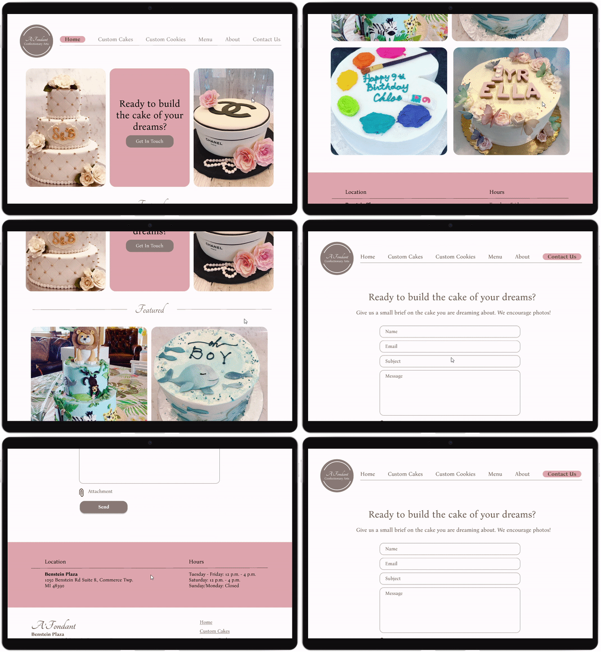
By having a clear action item, the user understands what the site’s purpose is and its capabilities.
Homepage
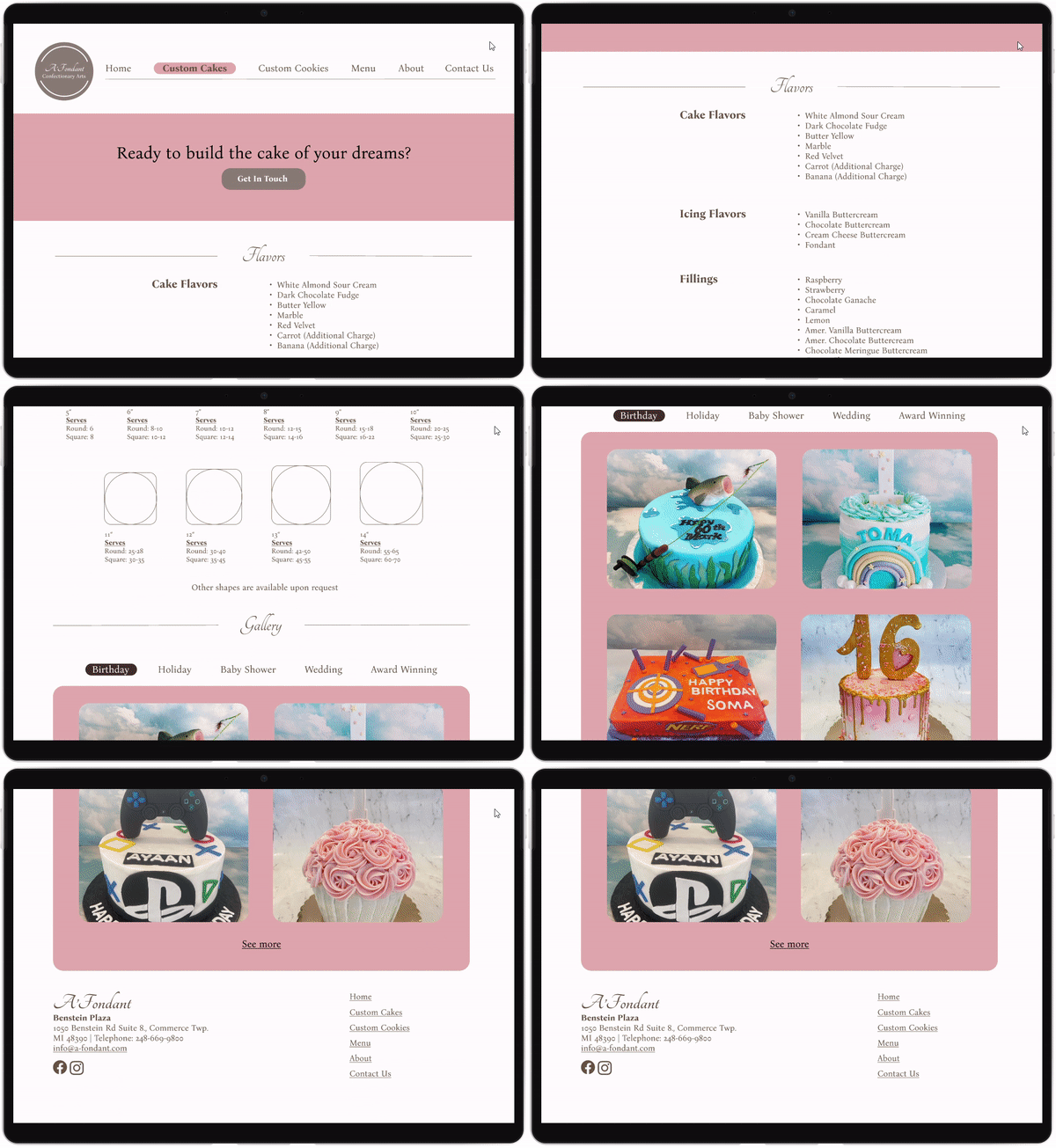
Having clear information helps users better understand the product and influences their decision making in a positive way.
Custom Cake Page
Guiding the user through the inquiry process yields for better results for both the user and the client.
Contact Us Page
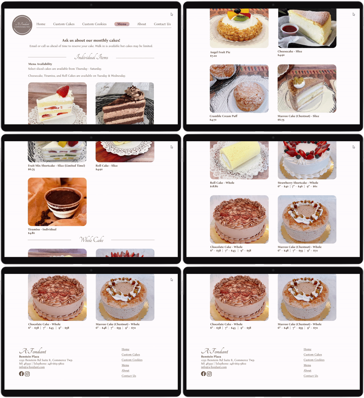
A clear menu page that advises when and what menu items are available, along with clear visuals to better inform the user.
Menu Page
USER RESEARCH
What are the user’s needs & pain points?
We want to understand the user’s needs when looking to purchase a custom cake or dessert. We’d like to know what information users are searching for and the areas that the site is currently lacking in.
Four individuals were recruited to be interviewed. Interviewees were amongst a varied age group.
RESEARCH OBJECTIVE
Understanding user’s expectations
I conducted interviews with the following questions in mind:
How do users gauge a bakery’s quality through a website?
What information does a user go to a bakery’s website for?
What concerns does the user have when ordering a custom cake?
HYPOTHESIS
Users measure a bakery’s products based on quality images, past creations, and through sufficient information. By portraying these items in an impactful way, users will be more likely to gain trust and purchase items from the store.
RESEARCH RESULTS
What did the user interviews reveal?
100% of Participants
Check a site to see what items they sell.
Looking for pricing.
Would like to know the location and hours of the store.
Gauge the quality of a bakery through pictures.
75% of Participants
Gauge the quality of a bakery through reviews.
Would like to know the flavors of the cake.
Pain Points
Unsure the difference between custom vs. fresh cake.
Lack of information (pricing, items offered, and flavors).
Images are small and hard to see unless clicked on.
CLIENT INTERVIEWS
Understanding the needs of the client
1
4
First Call - Project Kickoff
Covered foundational information to build both my understanding of the business and how we want to present the future site of the business. We also shared areas of opportunities for both content and the features within the site.
2
Since A’Fondant didn’t have an official logo we explored creating one and the image the client had for it. I also showed the client my initial ideas for the website. I wanted to focus on getting the information correct before moving towards high fidelity.
3
Second Call - Reviewing Low Fidelity Wireframes & Logos
Third Call - Solidifying Mid-High Level Wireframes
I presented a finalized logo to the client and gathered her finishing touches. We also reviewed the mid-high fidelity wireframes to affirm the structure of the site flowed well and that we tied any loose ends within the site.
Fourth Call - Finalizing High Fidelity Prototype
Client offered feedback for finishing touches and minor adjustments before fully transitioning Figma wireframes to the current Wix site.
COMPETITIVE ANALYSIS
What are the areas of opportunity?
The current market lacks a custom cake website with clear navigation along with sufficient information about the products. While Moose Pastry & Tea does provide a strong site, their specialty is in bread rather than custom cakes. However, since Moose Pastry & Tea is nearby and also offers Japanese style products, they are a close competitor.
Define
TARGET AUDIENCE
What type of users are we designing for?
Meet Whitney! Whitney is a young mom and eager to celebrate her baby’s first birthday. Whitney browses cake shops near her to order a custom cake for her baby. While browsing the stores cake gallery, she decides whether or not the cake shop is a quality cake shop based on images.
OVERALL GOAL
What are we trying to accomplish?
To refresh the client’s website with updated photos, information and a clearer structure that is easier to navigate for the user.
Ideate
SITEMAP
Reorganizing current and new information
To establish clear navigation, I began by identifying the most important products and information that the user would need. Creating the sitemap helped me visualize how I could potentially organize both existing & new information within the website.
JOURNEY MAP
Predicting the user journey
The journey map portrays the process from realizing that the user needs a cake to pick up. Each step shows what the user is potentially thinking and how it flows to the next step.
Design
SKETCHES
Low Fidelity Wireframes
To get an idea of the layout I wanted, I began sketching different options to see what option had the most potential. This provided a good foundation as I began to move onto the digital wireframes.
WIREFRAMES
Mid Fidelity Wireframes
My goal for the mid fidelity wireframe was to begin getting all the necessary information on the page and start organizing it in a way that would be digestible for users. I was able to play around with the content without investing too much time into it.
WIREFRAMES
High Fidelity Wireframes
After applying the brand identity to the wireframes, I was then able to show the client how the site would look before implementing it on her domain. The goal for the high fidelity wireframes was to maintain those original brand values of cute yet elegant.
WIREFRAMES
Mobile View
The original mobile site was not responsive so users were expected to zoom until they could read the information on the site. Therefore, creating a responsive mobile site was a top priority when I was updating the client’s website. Many users do their browsing on their phone, so having a website that can cater to mobile users boosts customer interactions.
BRAND IDENTITY
Re-building the brand with the client
I showed examples to the client on how the colors would work within the website and from there I guided her in choosing accessible colors that she felt matched her brand.
Upon consulting the client, she wanted the brand to feel cute but elegant. From there I created a logo that match that aesthetic that we could later implement onto the website.
Test
USABILITY TESTING
Do users find the website to be clear and informative?
Research Questions:
Is the website easy to navigate through?
Does the information flow in a natural way?
Does the user feel that they have enough information about the product?
I conducted four usability tests both remote and in-person and asked that each participant go through each page of the site and advise what their recommendations are and if they felt that all the information was clear and easy to understand.
Success Metrics
Could participants navigate to the contact page from homepage?
100% of participants were able to find the contact us page.
Though all the users were able to find the contact us page whether it was through the header or the CTA some participants did feel that the header didn’t clearly exhibit that it had been clicked on and could be communicated better.
Could participants easily find photos from past creations?
100% of users were able to comprehend the content of the recipe page.
Participants were easily able to find the photos from past creations. Users liked that custom cakes had different categories for different types of cakes.
ITERATION ONE
Contrast in the header
Users felt that there wasn’t enough of a contrast when the header was selected. I added background color to the text to signify when something had been selected. This small adjustment takes the stress away from users who are hard of seeing text up close and can rely on simply color if they wanted to.
Old Header
New Header
ITERATION TWO
Specificity in the menu
Users expressed that it would be helpful if they knew the unit for menu items. While most of the images do show one slice of cake, user mentioned to fully avoid any misunderstanding, it would be better to just specify on the site.
Old Page
New Page
USABILITY TESTING
Client Testing
ITERATION THREE
Clear breakpoint on the menu
The client also requested that the individual to go items were separated from the whole cakes so users could have a clear start and end point. Since I had been using the cursive and lines for headers it felt natural to include on the menu page as well.
Old Page
New Page
Outcome
RESULTS
How did the update help A’Fondant’s business?
The average growth from June - December 2022 (before re-design) vs. 2023 (after re-design) was 101% growth in average session duration.
2022: Average session duration was 2.11 mins
2023: Average session duration was 4.25 mins
Users spend twice as much time on A’Fondant’s site than before the re-design, making users twice as likely to make a purchase then before.
RESULTS
How did the update help the usability for users?
During implementation, I added a feature where the entire site can flip to Japanese by a click of a button.
During a 7-month period that immediately followed implementation of the feature, I found on average that 30% of users that come to the site use the Japanese language feature which improved usability for users.
BEFORE AND AFTER
Homepage
Before
After
BEFORE AND AFTER
Custom Cake Page
Before
After
Final Thoughts
Challenges
The main challenge was getting a clear idea of what the client wanted. Since the client didn’t even know what she wanted, I had to start creating design solutions and hope that they would meet her needs and then tweak the solutions along the way.
What I Learned
At the end of the day, the client trumps all. Since this business is her life and passion, there were some decisions that the client ultimately had me beat in. For example, the color, while I may have not gone with those colors, I guided her to make sure her colors were accessible and inclusive to all, but at the end of the day, she decided what colors would be used on her website.
What Comes Next
My plan is to update her current Wix site and to launch it with her approval. While Wix may not allow all the designs that I create in Figma, I will be facing those challenges head on and getting feedback from the client along the way.


