Mobile Application
An intuitive app that helps users find recipes with ingredients they have at home.
Duration
80 hours within 4 weeks
Role
Researcher and UI/UX Designer
Key Takeaway
Meal planning is a tedious task in many ways. Having an app to provide the user with recipe ideas based on ingredients the user already has, reduces not only mental strain for the user but food waste & cost as well.
Discover
Statistics show that the average American household wastes 31.9% of food they obtain. That is at least $1,500 a year based on a four person household.
PROBLEM DISCOVERY
How can we improve the meal planning process?
When it comes to meal planning users are faced with several obstacles. Users need to consider:
Food cost
Food waste
What to make
What ingredient they already have
With so many factors to consider, users ultimately end up making the same meals over and over again until their sick of it.
PREVIEW
Introducing Remix
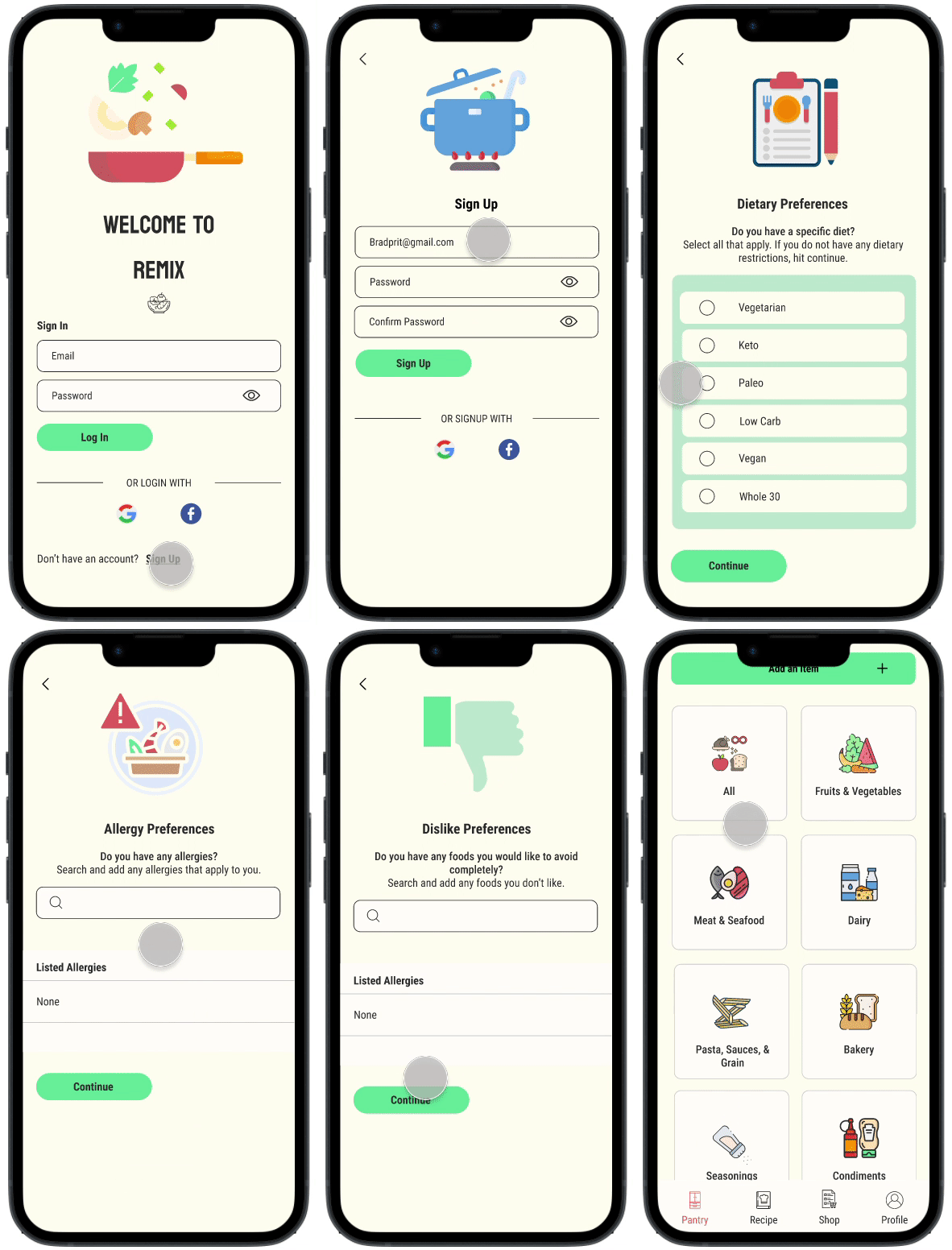
For new users signing up, once they establish their log in information, they will then have the option to choose their food preferences and/or their dietary restrictions to personalize their experience.
Sign In/ Sign Up
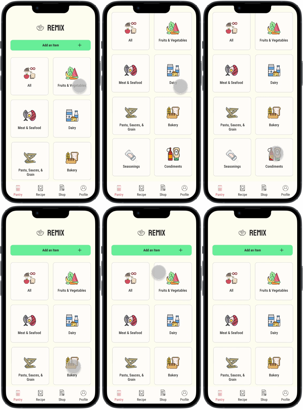
After completing the sign up process, users will be directed to the pantry page. Users will then have the option to view all the items they have in their pantry or view by category.
Pantry
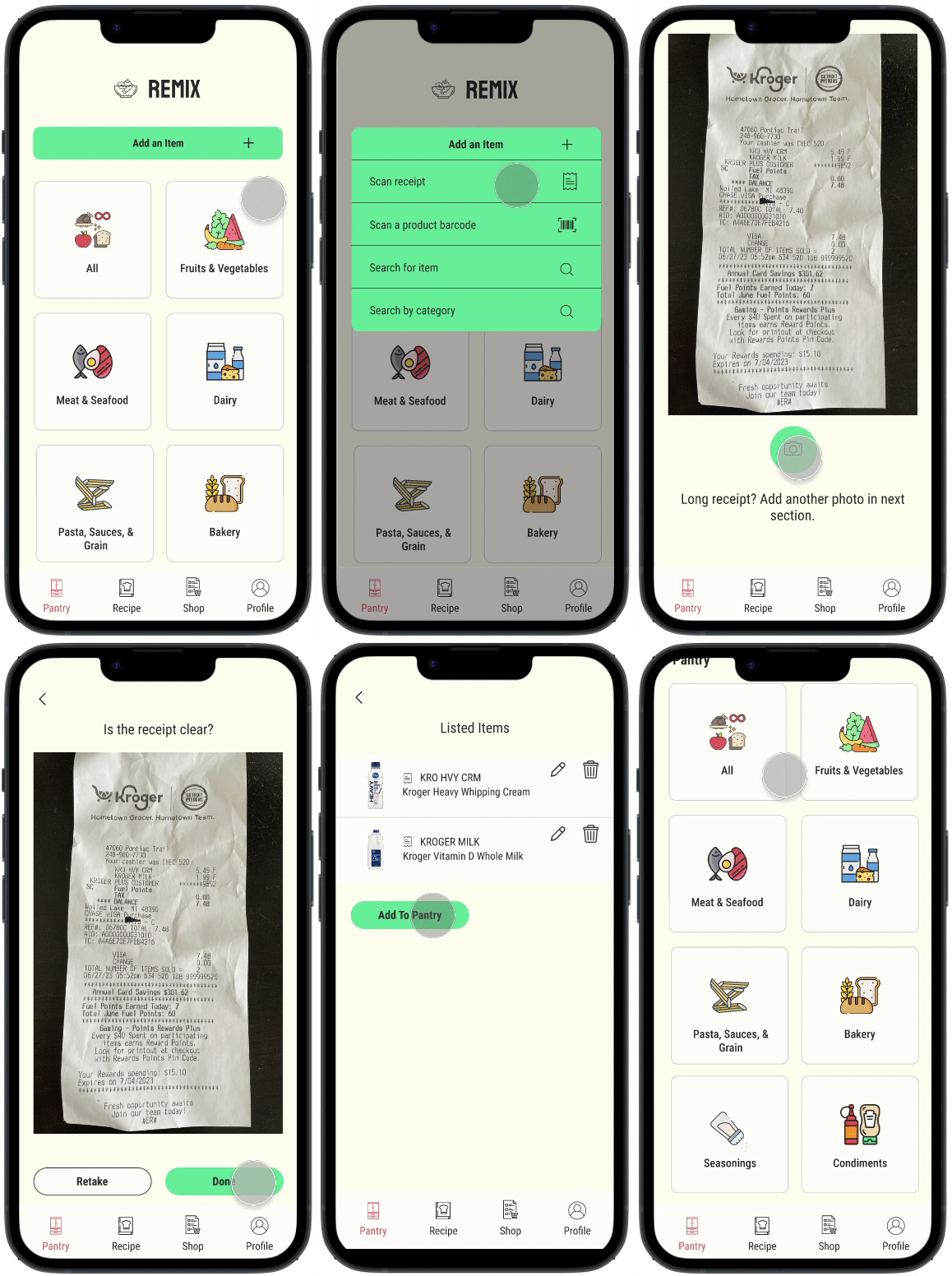
Users will then have the option to add an item by scanning a receipt, a barcode, or by searching the item by it’s name or category.
Add an Item
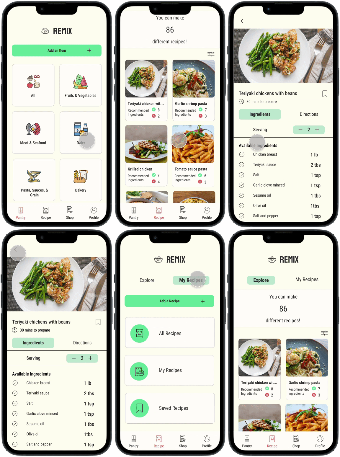
Once the user has loaded all their pantry items into the app, they would then be able to flip over to the recipe page and see how many ingredient they do and don’t have to make a meal.
Recipe
USER RESEARCH
What are the user’s needs & pain points?
We want to understand whether or not other participants experience the same frustrations that we do when deciding what meal to make along with what support they need within the meal planning process.
Five individuals were recruited to be interviewed. Interviewees were amongst a varied age group and all participants cook at least three or more times in a week.
RESEARCH OBJECTIVE
Understanding how we can benefit users
I conducted interviews with the following questions in mind:
How do users decide what to make?
What does meal planning look like to each person?
How do users’ budget and track their groceries?
What concerns do users have about food waste?
HYPOTHESIS
Users want an easy and intuitive way to track the items in their pantry while receiving meal suggestions based on the items they have available to alleviate the stress of meal planning and reduce food cost & waste.
RESEARCH RESULTS
What did the interviews reveal?
100% of Participants
Admit to having at least 10% food waste or more.
Plan their meals.
Mentally keep track of what ingredients they have at home.
80% of Participants
Go to the grocery store on a weekly basis.
Would like to be able to customize the amount of an ingredient they have.
Pain Points
Struggle with deciding what to eat/make.
Tend to make the same meals over and over.
Always have food waste.
COMPETITIVE ANALYSIS
What are the areas of opportunity?
The current market lacks an intuitive way for users to receive recipe suggestions based on items in your fridge or pantry.
While some competitors have come close, being able to both personalize and customize the user experience was a big area of opportunity to explore.
Define
MVP FEATURES
Potential features that will help solve our users problems
How might we help users take the burden off the meal planning process?
Provide an area to easily track what ingredients the user has on hand.
Personalized recipes based on actual ingredients the user has.
Optimized ways to import available ingredients into profile.
How might we personalize the meal planning experience for users with food restrictions?
Questionnaire to help users establish any dietary preferences.
Opportunity to list foods the user simply doesn’t like.
OVERALL GOAL
What are we trying to accomplish?
To create an mobile app that helps users reduce both food waste and cost by offering the user meal suggestions based on the items in their fridge/pantry.
TARGET AUDIENCE
What type of users are we designing for?
Meet Nicole! Nicole scrolls through Instagram constantly looking for new meal ideas. As soon as she finds the perfect dish she realizes she has almost none of the ingredients. Eager to cook this new dish, she goes to the store and picks up all the ingredients and makes a wonderful dinner. However now she is left with a bunch of leftover ingredients and isn’t sure how to repurpose them.
PRIORITY MATRIX
Which features will provide the biggest impact?
I sorted the potential features that were identified during the research process by both effort and user impact.
I then highlighted the most impactful features to potentially build out.
Ideate
USER FLOW
Exploring user goals
Building a user flow served as a way to map out the user experience between account creation and core functions of the app. It allowed me to visualize how a potential users could successfully reach their goal of getting recipe suggestion in a efficient way.
JOURNEY MAP
Predicting the user journey
This journey map shows how the user would go about accomplishing the goal of using the app by signing up, add items to the pantry, receive recipe recommendations, and save the recipe for future use.
Design
SKETCHES
Low Fidelity Wireframes
Using the user flows above, I began sketching out the wireframes to help me create a basis on what the app could potentially look like. It allowed to see what functions could work and provided a guideline for moving forward to the digital wireframes.
WIREFRAMES
Mid Fidelity Wireframes
With the mid fidelity wireframes, my main focus was making sure the functionality was intuitive and direct. With the wireframes, I was able to explore and try different concepts without spending too much time or resources.
WIREFRAMES
High Fidelity Wireframes
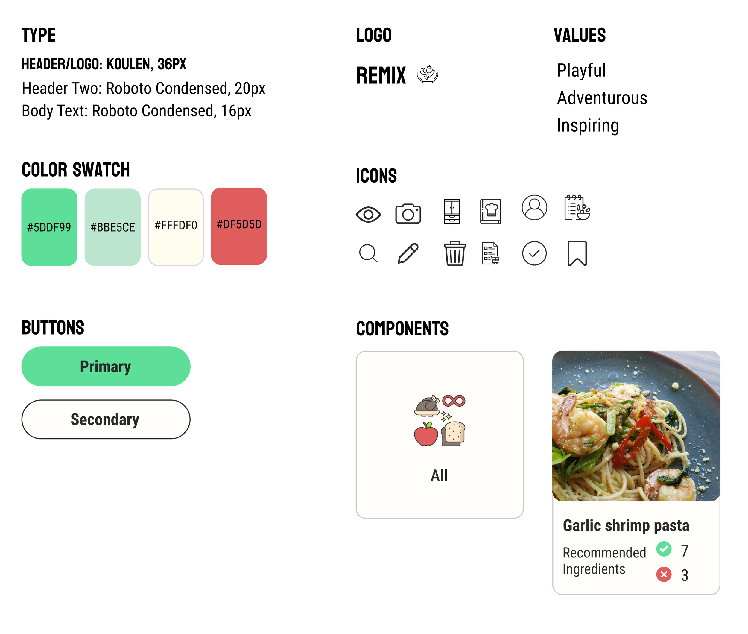
The intention for the high fidelity wireframes was to implement the brand identity. By adding playful touches to the wireframes, users are less likely to find meal planning to be a chore and instead something to look forward to.
Using visual design to add playful touches to mundane routines
BRAND IDENTITY
Developing a visual design system to express playfulness, accessibility, ease, and influence a better lifestyle.
Test
USABILITY TESTING
Do users find the feature to be useful and comprehendible?
Research Questions:
Does each flow make sense and feel intuitive?
Does the user find the feature valuable?
I conducted five usability tests both remote and in person. All participants cook on a regular basis. Surveying this beforehand assured that I would receive feedback from my potential target audience. Participants were asked to complete sign up, add items to pantry, and search for recipes to verify each flow both met the needs of the user and was easy to understand.
Success Metrics
Sign Up Flow
100% of users were able to complete the sign up process without any issues.
Participants advised that the sign up process was both easy to understand and straightforward.
Add an Item Flow
100% of users were able to add an item using the receipt function.
Participants felt that adding an item was intuitive and effortless.
Find a Recipe Flow
60% of users were able to comprehend the content of the recipe page.
Participants encouraged having more descriptive titles to reduce any misunderstandings.
ITERATION ONE
Clarifying the Wording
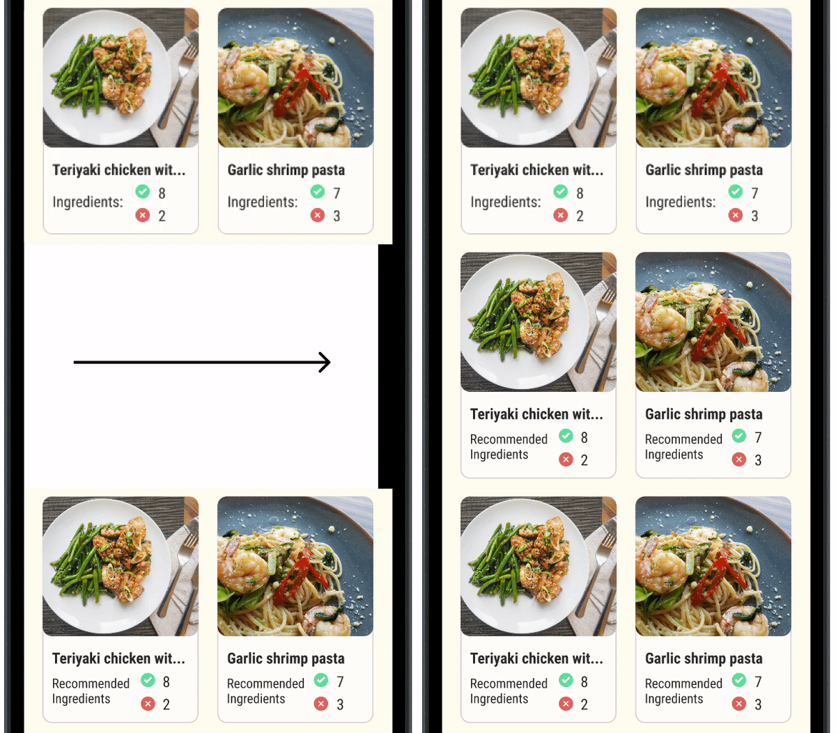
Changing the wording from “Ingredient” to “Recommended Ingredient” helped users better understand the purpose of the icons and numbers next to it.
Adjusting the wording reduced confusion and also gave the user the option to potentially skip an ingredient.
ITERATION TWO
Adding Titles & Prep Time
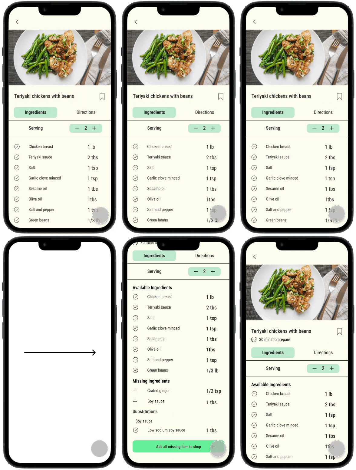
Having titles created more breakpoints between ingredients available and missing ingredients. Adding titles helped participants easily identify what ingredients are available and what they need.
Adding the prep time also helped users gauge the amount of time needed to prepare the recipe. Participants wanted to see this information early on to help decide whether they had the time to make the recipe.
Final Thoughts
Challenges
The main challenge was deciding how many features to build out and which features were the most important. As I was developing the app, I would start to get a bunch of ideas as to different directions I could go. Ultimately I decided to stick with basic functionality to strengthen my core functions.
What I Learned
I learned how to be decisive with my decisions and strengthen the wireframes I had built. I was able to gain a better understanding on the process of developing an mobile app and the thought process that goes into it.
What Comes Next
If I had more time:
Build out more functions such as the shopping list page.
Further develop the app to allow users to track the expiration dates of the food in their pantry.
Collaborate with grocery stores/grocery delivery to allow users to have their missing ingredients show up at their door.


